Hyang-Gi Case Study🌿
Project Overview
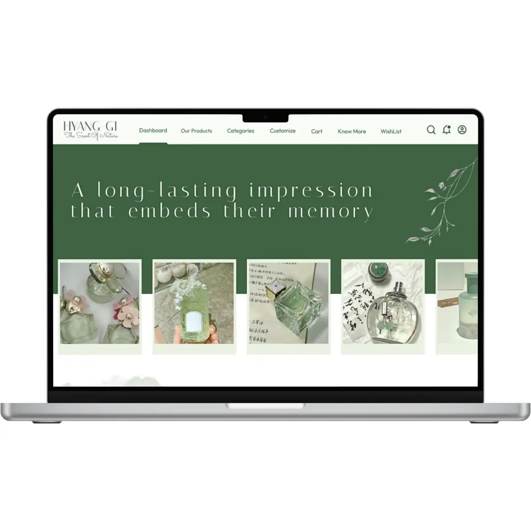
Hyang-Gi (meaning "fragrance" in Korean) is a conceptual perfume eCommerce experience designed to guide users through exploring, customizing, and purchasing fragrances in a calm and elegant way. As my first full UI/UX project, it blends clean visuals with thoughtful interaction to create an emotional shopping journey.
I handled everything from research & sketching to wireframing, high-fidelity design, and basic prototyping in Figma.
- Young adults interested in niche perfumes.
- People who shop online and enjoy personalization.
- Users who value design aesthetics and smooth UX.
Many perfume websites are cluttered or uninspiring, making it hard for users to connect with scents they can't smell. I aimed to create an elegant, story-driven shopping experience with simple customization.
- Simplify perfume browsing and customization
- Provide a calming, elegant interface
- Emphasize mood and storytelling in UI
- Improve user flow for purchases
Creating Hyang-Gi taught me the importance of structure, visual consistency, and thinking through the user’s perspective even in a self-initiated project.
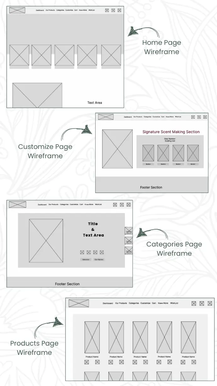
Wireframes
To visualize the core structure and flow of the app, I created low-fidelity wireframes for key pages including the home, product listing, customization, and checkout. These helped me focus on layout, functionality, and user journey before diving into visual design.
Creating these wireframes clarified how users would navigate and interact with the platform and guided my design decisions later on.
Design Process
As my first full project, I started by analyzing perfume websites to understand user expectations and common patterns. I defined key features like product discovery, customization, and categorization, then moved from rough sketches to wireframes and finally to high-fidelity screens in Figma—focusing on a calm, intuitive user journey.
Identified core features: discovery, customization, and categorization.
Researched perfume eCommerce websites for inspiration and best practices.
Created rough sketches and low-fidelity wireframes.
Designed high-fidelity UI in Figma with a clean, calming aesthetic.
Focused on smooth user
flow and visual hierarchy
Design Decisions

Outfit was used for most of the text for clarity and modern style, paired with Italiana for headings to add a refined, luxurious touch.
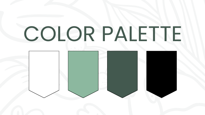
I chose soft, neutral tones to reflect elegance and a calming mood suitable for a perfume brand.